University project
Done in year 2014
Illustrated by Tricia Ho.
BRIEF:
To tell the design process of branding and identity exercise and design manual of a chosen client in the form of a book. The book should be perfect-bound on matt stock with a hard cover.
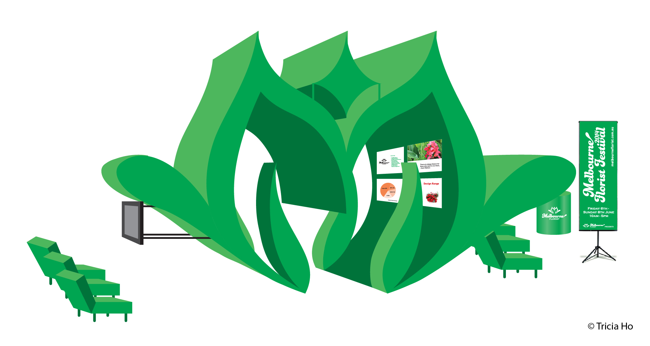
CLIENT:
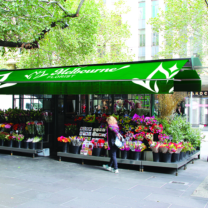
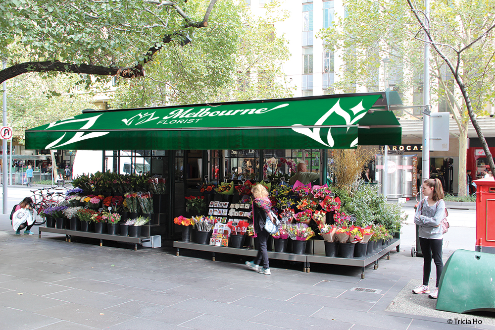
Melbourne Florist
IDEA:
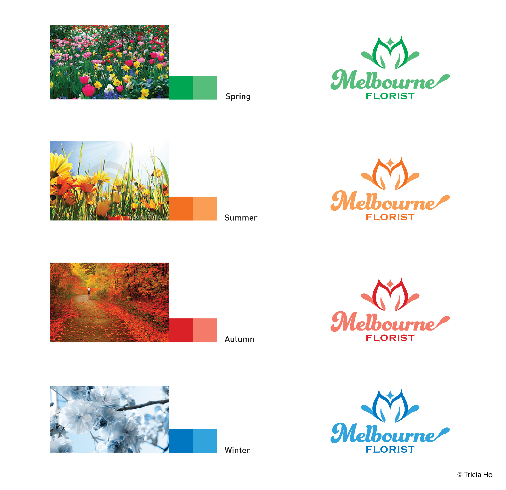
Flower can be seen in any season. Some flowers only bloom in winter season, whereas some flowers bloom in other season. Therefore, 4 colours represent 4 seasons and these 4 colours can apply in logotype too. The logotype is revamped to be more modern and feminine feeling. Besides that, the graphic elements can be created from the logotype and use in any applications.
PAPER MATERIAL:
Kiara paper 115gsm.
FINAL OUTCOME:
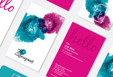
A hard cover perfect-bound is created. The book explains the design process such as label swap, research about the chosen client, moodboard and so on. The book also shows the design manual of the chosen client such as the logotype, Do’s and Don’ts, stationery design and a series of application design.